
Graeter's unveils refreshed branding, new pint design
An iconic Cincinnati brand has unveiled a new look.Graeter’s Ice Cream has announced a new logo that honors the company’s 155 history while still looking modern for future generations.“We’ve always believed that being the ‘Graetest’ means doing things our way – the right way – even when shortcuts exist,” said Richard Graeter, fourth-generation president and CEO, Graeter’s in a press release. “Our rebrand honors everything in our past while confidently looking ahead to the next generation of ice cream lovers. We’re setting the stage for the next chapter of taste.”The company says the new brand design brings a “modern vibrancy” to Graeter’s iconic heritage.A new logo keeps the company’s iconic script logo at the forefront of the company’s visual identity, shortening the length of the top and bottom of the “G” at the beginning of the company’s name.The new pint designs keep the flavor at the forefront, while also featuring a more eye-popping design throughout, with bold colors beginning at the lid and fading as you get to the bottom.“For longtime fans, the soul of Graeter’s hasn’t changed; it’s simply shining brighter than ever,” added Graeter. “Fans will still recognize the Graeter’s they love, and they’ll feel a renewed sense of pride, anticipation, and delight with every scoop.”The company says the new branding will roll out over the next year across its shops, grocery retail and in advertising. The branding effects are immediate on Graeter’s digital footprint, including the company’s website and social media.
An iconic Cincinnati brand has unveiled a new look.
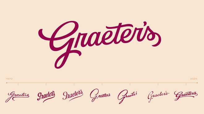
Graeter’s Ice Cream has announced a new logo that honors the company’s 155 history while still looking modern for future generations.
“We’ve always believed that being the ‘Graetest’ means doing things our way – the right way – even when shortcuts exist,” said Richard Graeter, fourth-generation president and CEO, Graeter’s in a press release. “Our rebrand honors everything in our past while confidently looking ahead to the next generation of ice cream lovers. We’re setting the stage for the next chapter of taste.”
The company says the new brand design brings a “modern vibrancy” to Graeter’s iconic heritage.
A new logo keeps the company’s iconic script logo at the forefront of the company’s visual identity, shortening the length of the top and bottom of the “G” at the beginning of the company’s name.
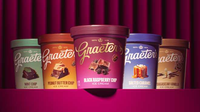
The new pint designs keep the flavor at the forefront, while also featuring a more eye-popping design throughout, with bold colors beginning at the lid and fading as you get to the bottom.
“For longtime fans, the soul of Graeter’s hasn’t changed; it’s simply shining brighter than ever,” added Graeter. “Fans will still recognize the Graeter’s they love, and they’ll feel a renewed sense of pride, anticipation, and delight with every scoop.”
The company says the new branding will roll out over the next year across its shops, grocery retail and in advertising. The branding effects are immediate on Graeter’s digital footprint, including the company’s website and social media.